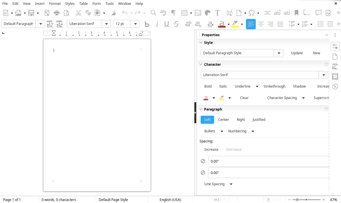
LibreOffice 7.0
LibreOffice 7.0 has just been released. I’ve been using LibreOffice since it was called StarOffice, so of course I wanted to install it right away. Here’s a quick and dirty review.

First things first, LibreOffice is a great office product. For most people, it does everything they’re ever going to need to do. Speaking for myself, I’ve been happy to use it for so long, I don’t remember when I started to use it. Before it was Libre for sure.
I wanted to get that out there because I don’t want people to think I don’t like LibreOffice. It does everything I need it to do and more.
So, what was my impression of 7.0? In a word, “Meh”.
The extra compatibility with Word is great. That’s the thing that I hear people complain about the most when it comes to LibreOffice. Reading Word files. Not Excel. Not PowerPoint. Word. Improving the compatibility with Word can only be a good thing. It’s not flashy, but it’s good.
Another improvement? Skia graphics engine. Again, more of a “under the hood” type of improvement. I’m sure this is going to be great in the future, but it’s not something that can look and see and oooo and ahhhh over.
Support for ODF 1.3. OpenDocument? Same. It’s great, but not exciting.
I’m going to bullet point most of the other features.
- New shapes galleries: arrows, diagrams, icons and more…
- Glow and soft edge effects for objects.
- Navigator is easier to use, with more context menus.
- Semi-transparent text is now supported.
- Bookmarks can now be displayed in-line in text.
- Padded numbering in lists, for consistency.
- Better handling of quotation marks and apostrophes.
These are all great features, and I’m happy as heck to have them. They are not exciting features though.
The last thing about this that I want to say is they’ve really got to work on the UI for LibreOffice. It’s not horrible, but it’s just dated. It feels like I’m using Office 97 every time I use it. It does the work, but it doesn’t look good doing it.
This version has a new icon theme, and that’s great, but it’s also the first thing I changed when I installed it. The new icon theme isn’t for Linux, I get that. I tried it anyway, and didn’t like it. The default for Linux is Elementary, and I didn’t really like that either. I most like the Sifr (SVG + dark), but there are still visual elements between LibreOffice’s themes and the icons that just annoy me.
I realize that the way an app looks should be less important than what it does, but when you’re trying to convince someone to move from Microsoft products to something else, it’s sure helpful to have that “something else” look like it’s comparable.
I’m going to stop whining now. LibreOffice 7.0 is a great version of LibreOffice, and it’s an extremely adequate office product. I know it’s shallow, but I just wish it was a little bit better looking.
Day 77 of the #100DaysToOffload Series.
Looking for comments? There are no comments. It's not that I don't care what you think, it's just that I don't want to manage a comments section.